Thursday, October 29, 2009

Color in Branding

Have you ever considered the importance of color in branding? Coke is red. UPS is brown. IBM is blue. These corporations understand the proper use of color is vital to creating a positive image among consumers. Furthermore, color plays a huge role in memory recall. It stimulates all the senses, instantly conveying a message like no other communication method.

Choosing the right dominant color for your brand is crucial. This color should appear on all your promotional materials, including your logo and product packaging. As much as possible, the color you choose should set you apart, work with your industry and image, and tie to your brand promise. It should also take into account color psychology, which is fairly complex. Colors can mean different things depending on the culture, situation and industry. However, in U.S. advertising at least, studies suggest some universal meanings:

Blue: Cool blue is perceived as trustworthy, dependable, fiscally responsible and secure. Strongly associated with the sky and sea, blue is serene and universally well-liked. Blue is an especially popular color with financial institutions, as its message of stability inspires trust.


Red: Red activates your pituitary gland, increasing your heart rate and causing you to breathe more rapidly. This visceral response makes red aggressive, energetic, provocative and attention-grabbing. Count on red to evoke a passionate response, albeit not always a favorable one. For example, red can represent danger or indebtedness.

Green: In general, green connotes health, freshness and serenity. However, green’s meaning varies with its many shades. Deeper greens are associated with wealth or prestige, while light greens are calming.

Yellow: In every society, yellow is associated with the sun. Thus, it communicates optimism, positivism, light and warmth. Certain shades seem to motivate and stimulate creative thought and energy. The eye sees bright yellows before any other color, making them great for point-of-purchase displays.

Purple: Purple is a color favored by creative types. With its blend of passionate red and tranquil blue, it evokes mystery, sophistication, spirituality and royalty. Lavender evokes nostalgia and sentimentality.

Pink: Pink’s message varies by intensity. Hot pinks convey energy, youthfulness, fun and excitement and are recommended for less expensive or trendy products for women or girls. Dusty pinks appear sentimental. Lighter pinks are more romantic.

Orange: Cheerful orange evokes exuberance, fun and vitality. With the drama of red plus the cheer of yellow, orange is viewed as gregarious and often childlike. Research indicates its lighter shades appeal to an upscale market. Peach tones work well with health care, restaurants and beauty salons.

Brown: This earthy color conveys simplicity, durability and stability. It can also elicit a negative response from consumers who relate to it as dirty. Certain shades of brown, like terracotta, can convey an upscale look. From a functional perspective, brown tends to hide dirt, making it a logical choice for some trucking and industrial companies.

Black: Black is serious, bold, powerful and classic. It creates drama and connotes sophistication. Black works well for expensive products, but can also make a product look heavy.

White: White connotes simplicity, cleanliness and purity. The human eye views white as a brilliant color, so it immediately catches the eye in signage. White is often used with infant and health-related products.

All the colors above can be categorized into two basic categories: warm and cold. In general, warm colors, like red and yellow, send an outgoing, energetic message, while cool colors, like blue, are calmer and more reserved. However, brightening a cool color increases its vibrancy and reduces its reserve.

Wednesday, October 28, 2009

Possible shift...

How to create an effective digital interface and design for other (cultural) groups by understanding which symbols, images, colours and typography they find most appealing.

The thesis proposal would be to create a digital prototype to educate designers on how to create effective advertisements and designs for other ethnic groups by understanding which symbols, images, colors and typography they find most appealing--and which they don't.

Freelancers, graphic design agencies and design educators will find this case study/data analysis invaluable. It would explore case studies, before & after comparisons and the dos and don'ts of designing for other cultures, keeping color and the psychology of color in mind. I would also look to include interviews with some leading design agencies, designers and artists from multiple cultures...hmm

Tuesday, October 27, 2009

More Color Theory

Color Theory is a set of principles used to create harmonious color combinations. Color relationships can be visually represented with a color wheel — the color spectrum wrapped onto a circle.

According to color theory, harmonious color combinations use any two colors opposite each other on the color wheel, any three colors equally spaced around the color wheel forming a triangle, or any four colors forming a rectangle (actually, two pairs of colors opposite each other). The harmonious color combinations are called color schemes – sometimes the term 'color harmonies' is also used. Color schemes remain harmonious regardless of the rotation angle.

"Color theory analyzes only the relationships of pure colors; it does not take color lightness and saturation into account. While your color scheme can use any tints, shades, and tones, color theory pays attention only to the hue component."


Brief History of Color Theory

The first color wheel was invented by Sir Isaac Newton. He split white sunlight into red, orange, yellow, green, cyan, and blue beams; then he joined the two ends of the color spectrum together to show the natural progression of colors. Newton associated each color with a note of a musical scale.

A century after Newton, Johann Wolfgang Goethe began studying psychological effect of colors. He noticed that blue gives a feeling of coolness and yellow has a warming effect. Goethe created a color wheel showing the psychological effect of each color. He divided all the colors into two groups – the plus side (from red through orange to yellow) and the minus side (from green through violet to blue). Colors of the plus side produce excitement and cheerfulness. Colors of the minus side are associated with weakness and unsettled feelings.

The current form of color theory was developed by Johannes Itten, a Swiss color and art theorist who was teaching at the School of Applied Arts in Weimar, Germany. This school is also known as 'Bauhaus'. Johannes Itten developed 'color chords' and modified the color wheel. Itten's color wheel is based on red, yellow, and blue colors as the primary triad and includes twelve hues.

Color on the Web

"The pure and simple truth is rarely pure and never simple."
Oscar Wilde

"First get your facts; then you can distort them at your leisure."
Mark Twain


The Web brings a level of constraint regarding the use of color; not only is there a difference in monitor quality and resolution, but there are only 216 'browser safe colors.' This is thought of as a concern of the past as statistics reveal that 65% of computers browsing the Web today display 16,777,216 different colors, but handheld devices are still limited to 256 colors.

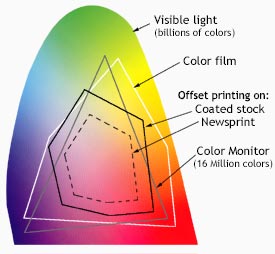
The Visible spectrum consists of billions of colors, a monitor can display millions, a high quality printer is only capable of producing thousands, and older computer systems may be limited to 216 cross-platform colors.

Reproducing color can be problematic with regard to printed, digital media, because what we see is not what is possible to get. Although a monitor may be able to display 'true color' (16,000,000 colors), millions of these colors are outside of the spectrum available to printers. Since digital designs are generated using the RGB color system, colors used in those designs must be part of the CMYK spectrum or they will not be reproduced with proper color rendering. Working within the CMYK color system, or choosing colors from Pantone© palettes insures proper color rendering.

Monday, October 26, 2009

Traditional Color Theory and the Importance of Color in Design/Art Education

Color is a critical part of design--whether your project is destined for print, web, video or other media. A clear understanding of color theory and practical applications is the key to using color with confidence. Learn to apply theory in digital applications, including Photoshop, Illustrator, InDesign, Flash, Dreamweaver and more. Learn the differences and applications for Pantone, CMYK, RGB, Hexadecimal colors, and other important color tools. The psychology of color and color harmonies are also addressed in traditional color theory classes.

I would like to see traditional color theory course begin to offer methods and exercises for the study of color, using the computer. The reasons for exploring color on the computer are numerous. Many educators prefer to use computers for color study so students can work quickly and avoid some of the drudgery of traditional paint/colored paper methods. Though there are some concepts that cannot be translated to the computer this tool does give students the advantage of speedy experimentation with many color solution and immediate applicaqtion of these solutions to art works. This makes the study of color immediately relevant as the student moves from color study to color application.

Art educators have not always had such a wide variety of media available to to teach their curricula and help students express their ideas but their addition of the computers to this tool set broadens these options enormously. Students could quickly recognize the value of being able to choose the most appropriate tools that best fit what they want to say. In the last ten years, the addition of computer technology to our media choices in the arts offers this generation of computer literate students wide choices for learning in a medium which they find completely natural to use.

Something I find to be key in color application, but sometimes overlooked in traditional color theory education is color management and calibration. It is important to find out how to get what you see on your monitor to match what comes out of your printer. The key is calibration and consistent color management. A successful designer needs to learn the basics, so that you can select and use calibration hardware and color management software to get consistent results for your digital photos, design proofs, and more.

I think it would be interesting and beneficial if students experimented with color systems and then applied color exercises to computer painting, storyboarding, or design assignments intended to illustrate expression or communication through color. This concept would allow pieces produced in color class to go on to become a portfolio piece and prove valuable in obtaining employment in design and animation industries.

The Colors of Norma Bar

The simple, strong palettes of negative space virtuoso Norma Bar.

This selection of work is from his two books, Guess Who? The Many Faces of Norma Bar & Negative Space, both are published by Mark Batty Publisher and are available for purchase on the publisher's website.

normabar4

normabar2

Negative Space

An artist using “negative space” relies on the space that surrounds the subject to provide shape and meaning. Of course, the term also refers to any topic that conjures feelings of unease and discomfort. Furthering the partnership begun with the publication of Guess Who? internationally acclaimed illustrator Noma Bar has compiled his newest collection of work, Negative Space. Including works commissioned by such prestigious publications as The Economist, Esquire, Wallpaper, The Guardian and Time Out London, as well as never before seen illustrations, in this book Bar focuses on subject matter ranging from sex, global warming and nuclear warfare to religion, crime and corporate greed.

With Negative Space, Noma Bar solidifies his reputation as an artist able to convert complex topics into clean, provocative and revealing lines that viewers take in with ease, though they are not easily forgotten.

bar_gun_0

bar_iraq_0

bar_tank388_0

normabar1

normabar3

Guess Who? The Many Faces of Norma Bar

It requires skilled eyes and hands for artists to render subjects by translating their personalities, physical traits and careers into a few well-executed lines. Having worked for such publications as The New York Times, Esquire, The Guardian and Time Out London, Noma Bar is one artist capable of such visual feats. From famous celebrities like Steven Spielberg to infamous ones like Michael Jackson, to cultural icons like Albert Einstein and Elvis, to political figures like George Bush and Sadaam Hussein, Bar has made a career of creating caricatures through illustrations that rely on the power of association, and sometimes a bit of imagination.

Stephen King has hatchet eyes; broken chains accent Nelson Mandela’s facial expression; Joseph Stalin’s nose and mouth are shaped like the hammer and sickle. All of Bar’s faces exude the power of the visual, in that we recognize his subjects by what they do.

Steven Heller’s introduction examines Bar’s work by placing it in the history of caricature, pinpointing the clear influences but also acknowledging it as something wholly unique in its approach to this art form with a long and distinguished lineage. Informative and playful captions accompany every illustration, providing insight into Bar’s process.

A true cross-over book, Guess Who? The Many Faces of Noma Bar will appeal to graphic designers and pop-culture fans alike.

Born in Israel in 1973, Noma Bar studied graphic design and typography at the Jerusalem Academy of Art & Design. He has been based in London since 2001. In 2003, Bar received his first national magazine commission from Time Out London, and since then he has worked for an array of media clients, including the BBC, Random House, The Observer, The Economist and Wallpaper.

normabar5

normabar6

Wednesday, October 21, 2009

User Experience

When it comes to user research it’s important for everyone involved in the design process to have an understanding about the insights we can gain with a particular research approach. As interaction designers we look to user experience (UX) research to discover usability problems or barriers to the experiences we create. As stakeholders get involved in UX research, questions are sometimes introduced that are intended to uncover user preference instead of usability problems. This can profoundly affect research results.

Consider this scenario: You’re observing a UX research session for a media player interface. Your goals include determining if a user can create a playlist and manage a list of videos. The session is also set up to question which media player design the user likes most and to ask the user to rate the visual appeal of the design.

Future Directions for Tactile Feedback

A variety of devices currently on the market provide simple forms of touch feedback, but none is an unqualified success - they all lack some aspect of physical experience, a correspondence with the way we actually interact with the world. Current tactile solutions fall short either in reconfigurability or in pre-interaction feedback. This pre-interaction feedback would provide the physical feeling of a button which the user can press or not, rather than just a tactile confirmation that they have just pressed that button. Reconfigurability would allow physically felt controls to change with the content of the display. In short, it’s easy to make static physical buttons, but not to make them disappear when not needed. And it’s easy to provide a physical sensation after the user interacts, but not to provide buttons that can be physically felt *before* the interaction is committed.

Several tactile feedback solutions have been proposed, explored in concepts, and in some cases brought to market to try make tactile feedback more realistic.

Physical overlays
This is a vinyl sheet placed atop the display, with holes to physically simulate buttons. The overlay solution is the least flexible, since it doesn’t reconfigure when the display changes (say when you’re watching a movie instead of typing). But this solution is possible, present in the market, and in at least one test case (Nintendo Emulator overlay), does apparently add some utility.

Air or Liquid filled bladders
One device concept
that seems to regularly make the rounds (reported early on by Gizmodo) suggests using liquid beneath the display surface to create real, touchable buttons on the surface of the device. While this solution may have some promise, no viable forms have yet appeared in the market, and several commenters have suggested the idea may not be implementable as described.

Piezoelectric mechanisms
A Nokia patent using piezoelectrics for a similar end was reported a few months back, and Apple has also patented some similar technologies. Market-ready versions of this technology have yet to be seen, but would likely have real promise as an apparently viable solution letting users feel buttons before they interact.

Pressable mechanical touchscreen
The Blackberry Storm touch-sensitive smartphone, whatever its other faults, did add a great tactile interaction. The entire screen presses in slightly (and evenly) when a button is pressed, giving the sensation of an actual button press. There is still no button-like tactile feedback prior to the press, but the press itself is surprisingly satisfying. And this approach lets the phone distinguish between ‘highlight’ and ‘press’ interactions, akin to the difference between ‘rollover’ and ‘click’ interactions when using the web on a PC. This clever and well-integrated tactile solution thus provides an additional level of control beyond that of competing devices.

The Band-aid display
A wearable flexible miniaturized tactile display also apparently uses piezoelectrics to deliver touch sensations directly to the fingertips. This solution could enable more flexible braille displays for the blind as well as enabling a ‘Minority Report’ style mid-air interaction (not that we’re convinced that’s actually the best ultimate solution for device interactions), but is still a ways off from commercial production.

Nanotech
More distant-future design concepts like Nokia’s ‘Morph’ nanotech phone concept also propose a physically reconfigurable tactile surface. Nanotech concepts will obviously take some time to come to market, when and if they do, but offer much more versatile solution, suggesting that devices can physically reconfigure to a much greated extent than in the solutions above.

Ultrasound
Even further out there (both in development time and in plausibility): ultrasound to simulate touch. This solution is complicated - the device has to track hand position in order to simulate feedback, and ultrasound has the potential to blow out eardrums if over-amplified. If current mobile devices interfere with pacemakers just imagine what mobile ultrasound devices could do. Here’s a Video of ultrasound interaction.

Summing Up
The implications for all these solutions are interesting but there are obvious potential drawbacks. Potential issues include the physical durability of the display, the protection of the display itself (How delicate would a piezoelectric screen be?), the safety of users (How can we ensure that ultrasound harms neither ears nor pacemakers?), and even the readability of visuals (Does reconfiguring the surface actually distort the image displayed?).

Personally, I would love to see mobile touch devices with real tactile sensations for buttons (and even more for other interactions - sliders, checkboxes, etc.). I have yet to see a tactile feedback device that approaches this goal. I believe the team that ultimately solves the problem and creates a physically ‘real’ experience that is still reconfigurable will gain a profound competitive advantage in the mobile market and beyond. That this has not already been achieved speaks to the difficulty of the problem.

Existing and Emerging Technologies for Designers and Artists


Tinker It:

http://www.tinkerkit.com/

TinkerKit is an Arduino-compatible physical computing prototyping toolkit aimed at design professionals.

The interest in physical computing as an area in development within the creative industries has been increasing rapidly. In response to this Tinker.it! is developing the TinkerKit to introduce fast iterative physical computing methodologies to newcomers, and particularly design professionals.

This project is currently under development by Tinker.it!


Halo
t
elepresence and video conferencing solutions
Collaboration solutions and global managed services for real time communication Content starts here

-HP Halo was recognized by the Environmental Defense Fund as a solution that is good for the environment and for business
- HP is committed to energy savings and environmental stewardship. From travel reduction to energy efficiency, HP Halo embodies these corporate goals.

  • Designed by DreamWorks Animation SKG™ in partnership with HP
  • The only telepresence and video conferencing offering that’s a truly global, fully managed end-to-end solution
  • The only telepresence solution that runs on a private network designed specifically for video collaboration
  • Delivers fully duplexed audio, company-to-company connections via the HP Halo Video Exchange Network and 24/7 support with Concierge service
  • Connects multiple studios around the world at one time via HP Halo Multipoint
  • HP Halo Webcasting: Extend your reach by turning your HP Halo studio into an in-house TV studio to broadcast to thousands around the world at one time
Touchscreens and Blind Users
Reuters reports on a CES event emphasizing the needs of blind users and the risks of the touchscreen trend. Some excerpts:
The craze for touch-screen gadgets, sparked by Apple Inc's popular iPhone, is raising worries that a whole generation of consumer electronics will be out of the reach of the blind.

Motown icon Stevie Wonder and other advocates came to the world's biggest gadget fest, the annual Consumer Electronics Show in Las Vegas this week, to convince vendors to consider the needs of the blind. [...]

Advocates argue that if product designers take into account blind needs, they would make electronics that are easier to use for the sighted as well.

The good news is that manufacturers do not need to put large sums of money into making products accessible, nor would they have to forsake innovation, said Chris Danielsen, a spokesman for the National Federation For The Blind.

"We don't want to hold up technological progress," he said. "What we're saying is, think about the interface and set it up in such a way that it's simple .... The simpler you make the user interface of a product, it's going to reach more people sighted or blind." [...]

With the popularity of touch screens, once simple products such as televisions and stereos have become difficult for blind people to use as they often require navigation of multiple menus that need to be seen to be used effectively.

"That's an increasing problem with new digital devices. It's easy to add feature after feature that's buried under menu after submenu," said Mike Starling, chief technology officer of National Public Radio, which is working on accessible options.

Manufacturers have been putting touch screens in everything from calculators and watches to computers and music players.

Sendero Group President Mike May, who is blind, joked, "Can I ski 60 miles an hour downhill? Yes. Use a flat panel microwave? No." Sendero makes GPS navigational devices that have an audio output for the blind.

There are also screen readers that give an audio reading of a phone's menu. But Anne Taylor, director of access technologies at the National Federation for the Blind, says they do not yet help her to use a touch-screen phone.

She said the ability to use a device without needing to look at it could help sighted people who are driving or older people whose eyesight is starting to deteriorate.

While blind users can buy screen-reading software for $300 upward, it tends to only work on certain phones, often the most expensive smartphones. Sendero said accessible technology is often expensive, and about 70 percent of the U.S. blind population is unemployed.

Taylor is using CES as a forum to present vendors a set of suggestions for product design that she sees benefiting both sighted and blind consumers.

For example, manufacturers could include an easy-to-use start-over button, different sounds for different menus, and controls with good tactile feedback.

Link: Touch-screen gadgets alienate blind (Reuters)

See also the NFB's Technology Center and Sendero Group.

Tuesday, October 20, 2009

SPEAKING IN COLOR

SPEAKING IN COLOR

Learning to Color

I come from a fine artist's background and learned about color by applying it to paint. I had my crayon set and yellow plus blue made green. This is because painting is a subtractive color set based on pigments. The chemicals used in creating the paint would react with each other when mixed and create green. You start with a white canvas and add colors until you get black. CMYK works in the same way. Cyan, Magenta, and Yellow are pigments that are mixed to create darker colors (black is also used, but only to reduce the need of having to mix CMY all of the time).

CMYK (subtractive color) pigment based

cyan (00ffff) magenta (ff00ff) yellow (ffff00) black (000000)

By default, photoshop, your computer monitor, and HTML files use RGB. RGB is an additive color set that is based on mixing light instead of pigments. Your monitor starts with black and adds different spectrums of light until you get white. In RGB the three primary colors are Red, Green, and Blue.

RGB (additive color) light based

red (ff0000) green (00ff00) blue (0000ff) white (ffffff)

Because RGB is based on light it has a much wider gamut of colors than pigment based color sets. In fact, all of the colors in CMYK are also in RGB (the reverse is not true). This means that Hex is unique in the sense that it is really has both RGB and CMYK.

Color Education

Can the introduction of a digital learning module enhance the experience of Color Theory Education at the college level?

Examine:

- Overview of existing technologies and where people project these technologies to go in the future.
- How is Color Theory taught traditionally?
- Who is using interactive media as educational tools? Is it effective?

It may be best to investigate the idea as an ADDITIONAL component to traditional methods, a means to enhance.

The content of a college level color course wouldn't change, but the delivery method and experience would.

What are the possibilities of utilizing Haptics Technology to simulate the physical gestures of mixing colors by hand?

Thursday, October 15, 2009

Exploration in Color and Social Media

Reflective color vs. Projected color. Design Education. How can you teach designers the mechanical aspect of mixing color using a digital learning module?

Teaching the concept of mixing color in a digital setting, is that better?

It is not a trick of the eye in the usual sense. The "color" your eye sees is composed of the wavelengths of light absorbed or reflected by the object.

There are essentially 3 ways to create a color effect: surface color, light color and reflected color. If a box is painted orange and illuminated by a white light, it will be recognized as an orange box. If that box is painted white and illuminated by and orange light, it will still appear orange in color. Without other cues, we cannot discern a difference between the orange-pigmented box and the orange-lit box. A third option is to reflect orange onto the surface of the box by shining a bright white light onto an adjacent surface of orange pigment. The surface is then positioned to reflect the colored light onto the white box. Again, the result is a box with apparently orange coloration. The subtractive color of a surface determines how much light will be reflected. The lighter in value it is, the higher the percent of light that will be returned. An off-white will yield 90% incidence of white light reflected. A light blue will reflect about 50 percent of the same light. The use of these three methods of color interaction is very popular in architectural applications.


How can social media create a digital classroom and encourage collaboration?
-needs focus

Friday, October 9, 2009

Thesis Proposals Revised

1. color theory and communication and as it applies in a global or universal commercial/business setting, true color applications in the real world, beyond the elementary concepts of split complimentary, contrast of hue and saturation, etc. (a manual or resource for designers in using color in design), especially concentrating on the use of color in the digital world. How does a reaction to the use of a color(s) in a digital format differ from one in a printed format? How does color originally designed for and applied in a 2D format translate to a 3D format, translation to the online or digital world?

2. utilizing technology to create a digital interface to engage a sense other than visual, (i.e senses like taste, smell, touch or sound) to use these technologies to communicate the same message a visual message would, only appealing stronger to a different sense. Researching how participants react to a digital interface created to appeal to one sense as opposed to another

3. using current knowledge of digital interfaces, accompanied by emerging technologies, to create a foundation for teaching design to an artist with physical disabilities- (lack of hearing, sight, or lack of verbal communication skills). A resource for design educators to use as a manual for ways to approach teaching disabled designers at the collegiate level

4. simulate the experience of a college-level design classroom setting using emerging technologies, current knowledge, and social media. Thinking about proposing a futuristic educational experience that does not involve a PHYSICAL classroom setting. (meeting in a digital classroom to learn about color, digital applications in design, conceptual development, etc.)

5. Creating an interface that integrates both an interactive and digital experience with a fine art experience. How to express the learning processes of the fine arts through a digital interface. (painting, screen printing, ceramics, etc)

Basic Interests in Research

-Color communication in educational design
-utilizing digital media to eliminate physical meetings in education, and creating a digital classroom
-eliminating the term "visual communication", and developing the concept that design appeals to all five senses
-using haptic technologies to create an interactive educational experience
-make sure the audience for the educational experience is college level

Thursday, October 8, 2009

The Beginning - A Statement of Intent

The idea of "visual communication" is a general term suggesting communication through visual aid. It is used loosely as an umbrella term for graphic design today. I feel like the design communication experience involves more than just vision. In most cases, design communication is influenced by all five senses. Color can evoke feelings of taste, and texture can evoke feelings of touch, and so on. I would like to encourage the elimination of the term "visual communication" into a more broad term, including the entire experience of a design.

That being said, I would like to create a complete design experience, engaging all 5 senses, through a digital interface. Using haptic technologies and digital innovations, I could create an interactive or virtual interface to be used as a design educational tool at the collegiate level.

-color
-interactive
-haptics
-design sensory
-education
-emotional design