Thursday, November 5, 2009

Hypothesis

-Hypothesis
Is the proposition that explains your argument. It states a proposed process of investigation and should reference facts to help build the context for your work.

By introducing this digital and interactive learning module, students will gain an understanding of how color works and how color interacts in the digital world, and better prepare them for applying color in real-life applications.

1. I first intend to research color science and color theory in depth.
-Where do the limits of color theory exist?

Monday, November 2, 2009

Research Presentation 785

You should begin to formulate your proposed thesis directions in the following manner:

-Research question
-Key words (6)
-Hypothesis
-Contextual rationale (the why and where it fits)
-Audience (who benefits)
-Method (the what and how)

You will have one slide for each of these modules so keep it concise, direct, and compelling.

-----

Details
-Research question
The research question creates a framework for your studies. It should not be too broad or too narrow and must offer benefit to a substantial group. Your topic should be one that can indeed be researched and measured. The inclusion of Who? What? When? Where? are a good way to develop a solid structure. The question may be predictive, solution based, comparative, or informative.

Can the implementation of a digital learning module enhance the experience of color theory education at a college level?

-Key words (6)
These terms will drive your discussion and search. You should be able to define each of these words (I will ask)

Color Science
Education
Interactive
Touch Technology and HCI (Human-Computer Interaction)
Electronic Media
Cognitive Engineering


-Hypothesis
Is the proposition that explains your argument. It states a proposed process of investigation and should reference facts to help build the context for your work.

By introducing this digital and interactive learning module, students will gain an understanding of how color works and how color interacts in the digital world, and better prepare them for applying color in real-life applications.

-Contextual rationale
The why and where it fits. What has been done previously? How is your work unique?

There is a current design trend of incorporating digital interfaces into education, in many disciplines. Art, specifically, is attached to this trend in the area of design.

I will be conducting a unique study of the mechanical and reflective means of creating color, while exploring different teaching strategies through both digital and traditional methods.

The final design will not only provide a useful tool for students, educators and practitioners, but will also measure progress and assess feedback.

-Audience
Who benefits? Is there an audience that will serve as research participants? These may be two distinct groups.

The main audience is college students studying color theory and color communication, educators preparing students in the discipline of art and design. Design practitioners could also greatly benefit from this tool during daily design research and application.

This research could be tested on future students in Color Theory and Communication 310 in the Department of Design at the Ohio State University.


-Method
The what and how.
Your approach of discovery and the tools you believe beneficial to this discovery.

The initial study will involve in depth research in the areas of color theory, color science, Human-Computer Interaction and cognitive engineering. I will need to pursue a thorough examination of current applications of digital media in education, as well as future trends in electronic media, especially in the realm of education. A solid understanding of color interaction, communication, psychology and color science is required. How the eye perceives color and why...etc..

After the initial study, the project will progress to the development and design of the learning module. The projected module will allow students to manipulate color through a systematic and scientific approach, using touch technology. The interaction will replicate the same methods used in mixing real paint or ink, simulating the texture and viscosity of the medium chosen through the application. The digital learning module will also allow the ability to manipulate colors with scientifically tried and true color, in multiple methods of mixing color, such as projected vs. reflective, based on the user's preference.

Once the module is complete, and ready for testing, the module could be introduced as an addition to the curriculum, surveying students' responses to the new media. A comparative study will take place, using both the new digital method, as well as the traditional method of cut paper and mixing of paint. Practicing designers could examine the effects of the tool as well.

Thursday, October 29, 2009

Color in Branding

Have you ever considered the importance of color in branding? Coke is red. UPS is brown. IBM is blue. These corporations understand the proper use of color is vital to creating a positive image among consumers. Furthermore, color plays a huge role in memory recall. It stimulates all the senses, instantly conveying a message like no other communication method.

Choosing the right dominant color for your brand is crucial. This color should appear on all your promotional materials, including your logo and product packaging. As much as possible, the color you choose should set you apart, work with your industry and image, and tie to your brand promise. It should also take into account color psychology, which is fairly complex. Colors can mean different things depending on the culture, situation and industry. However, in U.S. advertising at least, studies suggest some universal meanings:

Blue: Cool blue is perceived as trustworthy, dependable, fiscally responsible and secure. Strongly associated with the sky and sea, blue is serene and universally well-liked. Blue is an especially popular color with financial institutions, as its message of stability inspires trust.


Red: Red activates your pituitary gland, increasing your heart rate and causing you to breathe more rapidly. This visceral response makes red aggressive, energetic, provocative and attention-grabbing. Count on red to evoke a passionate response, albeit not always a favorable one. For example, red can represent danger or indebtedness.

Green: In general, green connotes health, freshness and serenity. However, green’s meaning varies with its many shades. Deeper greens are associated with wealth or prestige, while light greens are calming.

Yellow: In every society, yellow is associated with the sun. Thus, it communicates optimism, positivism, light and warmth. Certain shades seem to motivate and stimulate creative thought and energy. The eye sees bright yellows before any other color, making them great for point-of-purchase displays.

Purple: Purple is a color favored by creative types. With its blend of passionate red and tranquil blue, it evokes mystery, sophistication, spirituality and royalty. Lavender evokes nostalgia and sentimentality.

Pink: Pink’s message varies by intensity. Hot pinks convey energy, youthfulness, fun and excitement and are recommended for less expensive or trendy products for women or girls. Dusty pinks appear sentimental. Lighter pinks are more romantic.

Orange: Cheerful orange evokes exuberance, fun and vitality. With the drama of red plus the cheer of yellow, orange is viewed as gregarious and often childlike. Research indicates its lighter shades appeal to an upscale market. Peach tones work well with health care, restaurants and beauty salons.

Brown: This earthy color conveys simplicity, durability and stability. It can also elicit a negative response from consumers who relate to it as dirty. Certain shades of brown, like terracotta, can convey an upscale look. From a functional perspective, brown tends to hide dirt, making it a logical choice for some trucking and industrial companies.

Black: Black is serious, bold, powerful and classic. It creates drama and connotes sophistication. Black works well for expensive products, but can also make a product look heavy.

White: White connotes simplicity, cleanliness and purity. The human eye views white as a brilliant color, so it immediately catches the eye in signage. White is often used with infant and health-related products.

All the colors above can be categorized into two basic categories: warm and cold. In general, warm colors, like red and yellow, send an outgoing, energetic message, while cool colors, like blue, are calmer and more reserved. However, brightening a cool color increases its vibrancy and reduces its reserve.
Wednesday, October 28, 2009

Possible shift...

How to create an effective digital interface and design for other (cultural) groups by understanding which symbols, images, colours and typography they find most appealing.

The thesis proposal would be to create a digital prototype to educate designers on how to create effective advertisements and designs for other ethnic groups by understanding which symbols, images, colors and typography they find most appealing--and which they don't.

Freelancers, graphic design agencies and design educators will find this case study/data analysis invaluable. It would explore case studies, before & after comparisons and the dos and don'ts of designing for other cultures, keeping color and the psychology of color in mind. I would also look to include interviews with some leading design agencies, designers and artists from multiple cultures...hmm

Tuesday, October 27, 2009

More Color Theory

Color Theory is a set of principles used to create harmonious color combinations. Color relationships can be visually represented with a color wheel — the color spectrum wrapped onto a circle.

According to color theory, harmonious color combinations use any two colors opposite each other on the color wheel, any three colors equally spaced around the color wheel forming a triangle, or any four colors forming a rectangle (actually, two pairs of colors opposite each other). The harmonious color combinations are called color schemes – sometimes the term 'color harmonies' is also used. Color schemes remain harmonious regardless of the rotation angle.

"Color theory analyzes only the relationships of pure colors; it does not take color lightness and saturation into account. While your color scheme can use any tints, shades, and tones, color theory pays attention only to the hue component."


Brief History of Color Theory

The first color wheel was invented by Sir Isaac Newton. He split white sunlight into red, orange, yellow, green, cyan, and blue beams; then he joined the two ends of the color spectrum together to show the natural progression of colors. Newton associated each color with a note of a musical scale.

A century after Newton, Johann Wolfgang Goethe began studying psychological effect of colors. He noticed that blue gives a feeling of coolness and yellow has a warming effect. Goethe created a color wheel showing the psychological effect of each color. He divided all the colors into two groups – the plus side (from red through orange to yellow) and the minus side (from green through violet to blue). Colors of the plus side produce excitement and cheerfulness. Colors of the minus side are associated with weakness and unsettled feelings.

The current form of color theory was developed by Johannes Itten, a Swiss color and art theorist who was teaching at the School of Applied Arts in Weimar, Germany. This school is also known as 'Bauhaus'. Johannes Itten developed 'color chords' and modified the color wheel. Itten's color wheel is based on red, yellow, and blue colors as the primary triad and includes twelve hues.

Color on the Web

"The pure and simple truth is rarely pure and never simple."
Oscar Wilde

"First get your facts; then you can distort them at your leisure."
Mark Twain


The Web brings a level of constraint regarding the use of color; not only is there a difference in monitor quality and resolution, but there are only 216 'browser safe colors.' This is thought of as a concern of the past as statistics reveal that 65% of computers browsing the Web today display 16,777,216 different colors, but handheld devices are still limited to 256 colors.

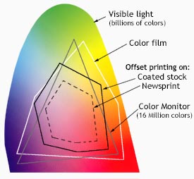
The Visible spectrum consists of billions of colors, a monitor can display millions, a high quality printer is only capable of producing thousands, and older computer systems may be limited to 216 cross-platform colors.

Reproducing color can be problematic with regard to printed, digital media, because what we see is not what is possible to get. Although a monitor may be able to display 'true color' (16,000,000 colors), millions of these colors are outside of the spectrum available to printers. Since digital designs are generated using the RGB color system, colors used in those designs must be part of the CMYK spectrum or they will not be reproduced with proper color rendering. Working within the CMYK color system, or choosing colors from Pantone© palettes insures proper color rendering.

Monday, October 26, 2009

Traditional Color Theory and the Importance of Color in Design/Art Education

Color is a critical part of design--whether your project is destined for print, web, video or other media. A clear understanding of color theory and practical applications is the key to using color with confidence. Learn to apply theory in digital applications, including Photoshop, Illustrator, InDesign, Flash, Dreamweaver and more. Learn the differences and applications for Pantone, CMYK, RGB, Hexadecimal colors, and other important color tools. The psychology of color and color harmonies are also addressed in traditional color theory classes.

I would like to see traditional color theory course begin to offer methods and exercises for the study of color, using the computer. The reasons for exploring color on the computer are numerous. Many educators prefer to use computers for color study so students can work quickly and avoid some of the drudgery of traditional paint/colored paper methods. Though there are some concepts that cannot be translated to the computer this tool does give students the advantage of speedy experimentation with many color solution and immediate applicaqtion of these solutions to art works. This makes the study of color immediately relevant as the student moves from color study to color application.

Art educators have not always had such a wide variety of media available to to teach their curricula and help students express their ideas but their addition of the computers to this tool set broadens these options enormously. Students could quickly recognize the value of being able to choose the most appropriate tools that best fit what they want to say. In the last ten years, the addition of computer technology to our media choices in the arts offers this generation of computer literate students wide choices for learning in a medium which they find completely natural to use.

Something I find to be key in color application, but sometimes overlooked in traditional color theory education is color management and calibration. It is important to find out how to get what you see on your monitor to match what comes out of your printer. The key is calibration and consistent color management. A successful designer needs to learn the basics, so that you can select and use calibration hardware and color management software to get consistent results for your digital photos, design proofs, and more.

I think it would be interesting and beneficial if students experimented with color systems and then applied color exercises to computer painting, storyboarding, or design assignments intended to illustrate expression or communication through color. This concept would allow pieces produced in color class to go on to become a portfolio piece and prove valuable in obtaining employment in design and animation industries.